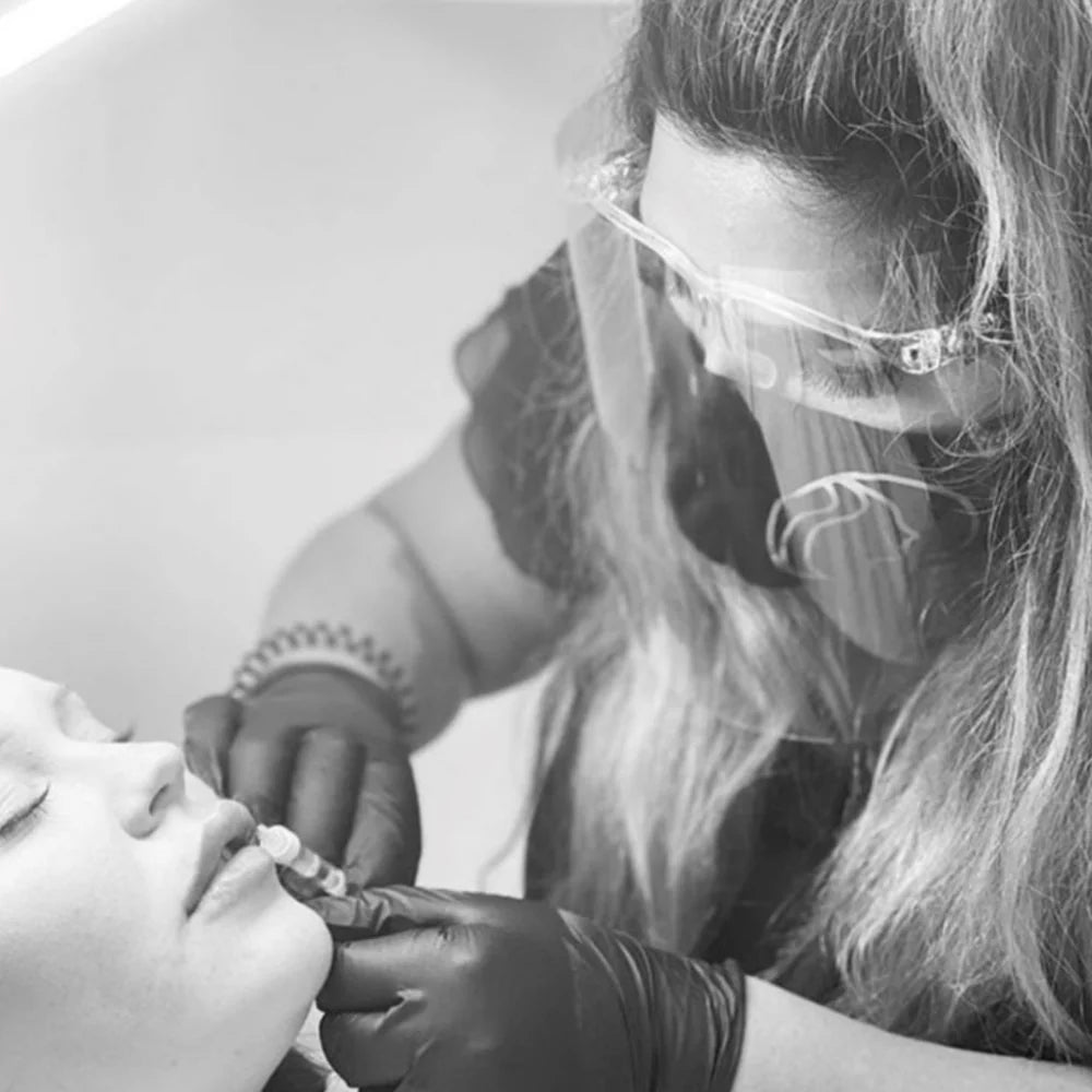
Nee's Aesthetics
Using a website redesign to increase user friendliness, develop a manageable website build for the owner, and integrate Klarna.
We were initially apporach by Neelam, owner of Nee's Aesthetics, to increase her bookings by adding Klarna to her website. But during our initial discussions issues with her previous website were raised.
Neelam explained "Jacob was recommended by a friend and colleague to assist with klarna integration on my website. However, at the time I wanted to implement this, I found my website wasn’t functioning as it should and I had ran into an issue with my previous website designer
I explained to Jacob the lack of trust I had in my previous website designer, and how upset it had left me. We then went through the overall vision for my brand and how we could move forward from this. After discussing my options, I decided to to have the whole website redesigned and information transferred over so that it functioned as I had hoped ahead of launching Klarna on my website."
There were three key elements Neelam wanted us to improve in the website redesign, these were:
-
1. Improving user experience
Improving the flow of the website and how the technical elements of Nee's Aesthetics services are explained to their clients.
-
2. Building a manageable website
It was imperative that we developed a website that allowed Neelam to manage her content, allowing her to make amendments at ease.
-
3. Integrating Klarna payments
Neelam wanted her treatments to become more accessible by allowing her clients to pay in instalments through Klarna.
Once we had outlined a detailed plan. We could get to work on the website build, and support Neelam in elevating her brand to the next level. We agreed on a timeline and began to put her vision together.
Neelam said: "Jacob communicated everything well and took everything that I said onboard. We built up a rapport very quickly, and I soon realised that he’s extremely trustworthy and really creates something with your best interests and ideas in mind.
He gave me options on things like the flow of the website, how to display my treatment options, and offered ideas on what would work best by telling me the pros and cons. Throughout the process he was honest - when he thought something looked too congested from my audiences point of view, he would offer suggestions on how to make it work. This was helpful as the information on my website needed to be clear yet concise.
Jacob also managed to integrate our booking system and I couldn’t be happier as it’s a seamless way to book and access information now merged into one place on my website.

Brining your vision to life...
"My vision has been brought to life - the colours are more vivid, and overall the website is such good quality. It’s easy and smooth to navigate for my customers, and it’s easy for myself or a team member to use and add changes when necessary without the knowledge of a web designer or digital marketer.
If you’re thinking about using his services ; take a leap and do it… 10000% recommended! "
Neelam Akhtar, Nee's Aesthetics
